Links
Why This Project Matters
This was one of the first real projects I built when I started learning JavaScript — four years ago, with no AI, limited internet, and a lot of curiosity. Sometimes I look back at it and I’m genuinely in awe that I made something like this on my own. I don’t lean toward frontend as much anymore — I enjoy backend engineering more now — but I’m still proud of this. Not just because of what it is, but because of the resilience I found while building it. The workarounds I came up with back then surprise me even now.
The Stack (or Lack of One)
Pure vanilla HTML, CSS, and JavaScript. Three files:
index.html— the pagestyle.css— all the stylingapp.js— the entire application logic
No React. No Three.js. No WebGL. No canvas. Just <div> elements and CSS transforms. That’s it. Every face, every sticker, every rotation — it’s all divs moving here and there.
How the Cube Is Rendered
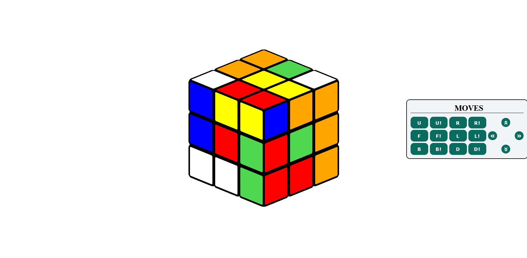
This is the part that still amazes me. There’s no 3D engine here. No WebGL. No canvas. It’s 154 divs — 27 cube pieces, each with 6 face divs — all positioned in 3D space using nothing but CSS transforms.
27 cube-piece divs, each containing 6 child divs for faces (front, back, left, right, top, bottom). Everything is positioned using transform-style: preserve-3d and translateX/Y/Z. That’s the entire rendering engine: CSS and divs pretending to be a 3D scene.
.cube-container {
  perspective: none; /* orthographic — no foreshortening */
  transform: rotateX(66deg) rotateZ(45deg); /* that classic isometric look */
}
The perspective: none gives it that flat, isometric style where parallel lines stay parallel — no vanishing point. Every piece looks the same size regardless of depth. It’s not realistic, but it looks right for a Rubik’s Cube.
The Dummy Row Hack
This is the most interesting part of the project, and the part I’m most proud of figuring out.
The Problem
When you rotate a face of a real Rubik’s Cube, the 9 pieces on that face move together as a single unit. In CSS, you can animate a single element with a transition — easy. But these 9 pieces are sibling divs. Just plain divs sitting next to each other. You can’t group divs, animate them as one, and then ungroup them. There’s no transition: rotate on a “group of divs.”
Even worse: after a U move, a piece that was on the left face moves to the front. Its axis of rotation changes from Y-axis to X-axis. If you animated each piece individually, you’d need to track every piece’s current 3D position, compute its rotation axis for the next move, and handle the matrix math. For a beginner learning JS, that’s a wall.
The Solution
Instead of animating pieces individually, I clone them into a temporary container, animate that, then restore the originals:
- Clone the 9 pieces being rotated into a single
.dummycontainer - Hide the originals (
display: none) - Animate the dummy with a
transition: 0.5s linearrotation - After 550ms, restore the originals (now with updated state/colors) and clear the dummy
// Simplified version of the dummy approach
function rotateFace(face) {
  // Clone the 9 pieces of this face into a dummy container
  const dummy = document.createElement('div');
  dummy.classList.add('dummy');
  facePieces.forEach(piece => dummy.appendChild(piece.cloneNode(true)));

  // Hide originals, show dummy
  facePieces.forEach(p => p.style.display = 'none');
  cube.appendChild(dummy);

  // Trigger the rotation
  requestAnimationFrame(() => {
    dummy.style.transition = 'transform 0.5s linear';
    dummy.style.transform = `rotate${axis}(${degrees}deg)`;
  });

  // After animation completes, restore state
  setTimeout(() => {
    updateCubeState(face);
    dummy.remove();
    facePieces.forEach(p => p.style.display = '');
  }, 550);
}
The axis problem disappears. I don’t care which axis each piece is on. I just grab the 9 divs that need to rotate, clone them into one container, rotate that container once, then update the logical state. The animation is always just a single rotateX, rotateY, or rotateZ on the dummy. Just divs, clones, and CSS doing the heavy lifting.
The tradeoff is the clone-hide-restore cycle (and the visual risk of flickering), but it’s way simpler than maintaining per-piece 3D transforms through every move.
Cube State
Six arrays of 9 integers each — one range per face (color IDs 1-54). A blit() function maps these integer ranges to background colors on the DOM stickers. That’s the “state” — just numbers. The blit turns those numbers into colored div faces.
Moves like R and U are direct index permutations — hand-written swaps. Some moves like R! and U! are implemented as 3x forward moves (triple application = inverse). Others like F, B, and L use whole-cube rotation decomposition: rotate the entire state, apply a known move, rotate back.
What I Learned
This project taught me that you don’t need the “right” tools to build something interesting. You need curiosity, patience, and willingness to try weird hacks like the dummy container approach.
The dummy technique is the kind of thing you’d only discover through experimentation — not from a tutorial. It’s not “correct” engineering. But it solved a real problem within the constraints I had, and that’s what matters.
I don’t do much frontend work anymore, but the resilience I built during this project — the willingness to sit with a problem and invent a workaround instead of giving up — that stayed with me. It shows up in my backend work, in how I debug, in how I approach problems in general. Sometimes I surprise myself with it.